tpt
Strategy • Company Mark (1999)
Mark Update (2015)
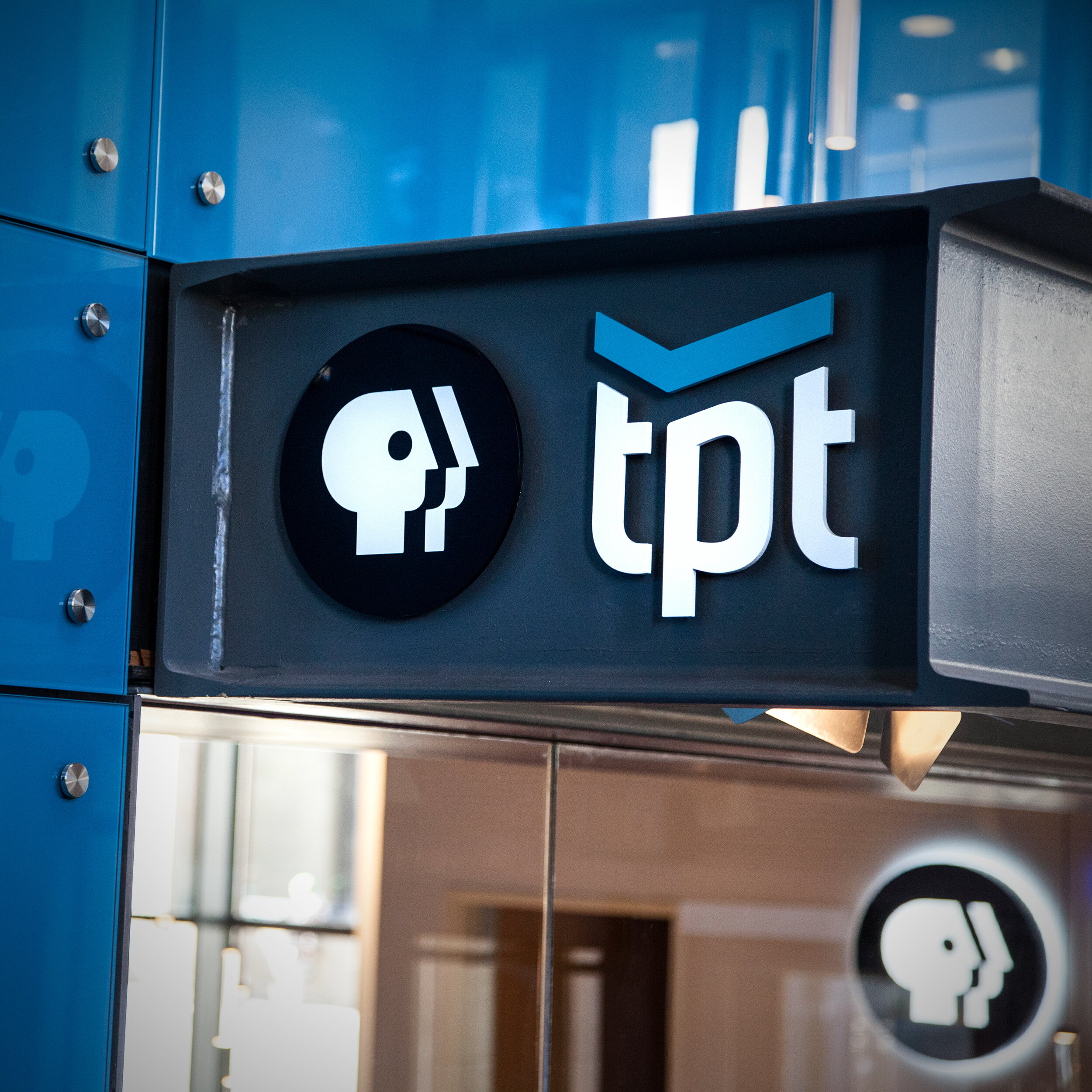
In the late 1990’s KTCA (Channel 2) found themselves in predicament brought on by changing technology. As broadcast television was evolving from analog to digital signals, along with that came a major change to how channels were organized and offered to the audience. KTCA was casually known as Channel 2. That was their identity… “Channel 2”… and that’s where you could find PBS in the Twin Cities market. With a digital signal, they were now going to be able to offer multiple channels at the same time. Needing to move away from using the KTCA call letters, they decided to change their name to TPT (Twin Cities Public Television). This new existence required a mark that could work as a centerpiece of a family of channels while also working in a complimentary way with the existing PBS logo.
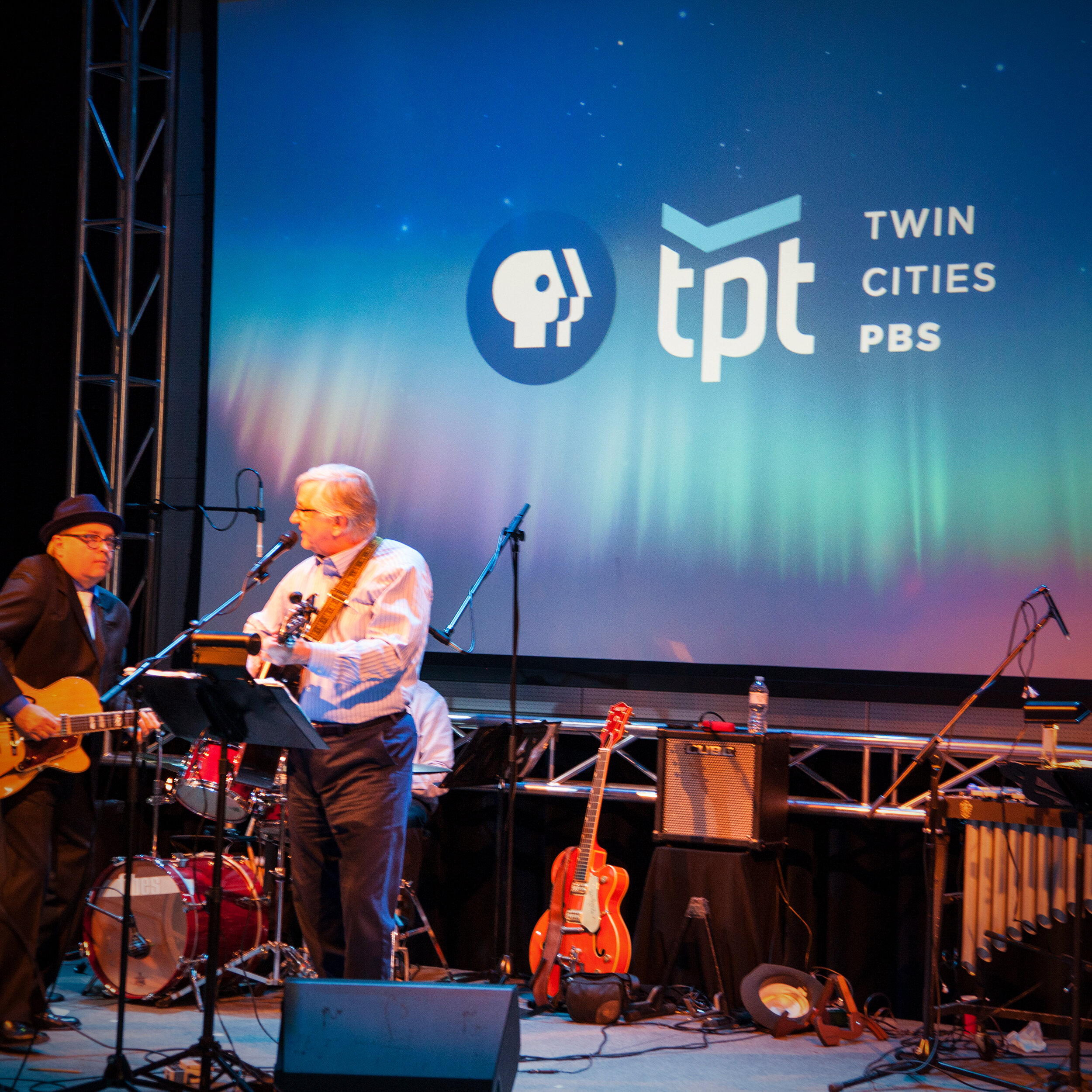
Dan Baggenstoss designed the original mark for TPT in 1999. This included variations of the mark for TPT2, TPT16, TPT17, TPTKids and TPTDigital as well as multiple layout variations and the ability to grow as things changed. Dan further brought the TPT mark to life by concepting and directing a collection of 3D animations for use in broadcast. In 2015, TPT was interested in further leveraging their relationship with PBS. Through strategic consulting and visual exploration, TPT settled on retaining the equity they had built while introducing a new name/descriptor… Twin Cities PBS. Dan led that strategy as well as a polishing of the original mark.
Dan Baggenstoss designed the original TPT mark in 1999 while employed at Yamamoto Moss and led the Strategy & Design of the TPT mark update in 2015 while employed at Capsule